An end-to-end iOS app for finding ingredient substitutions
Switch & Bake
Project Date: March 2022
Company: Switch & Bake
My Role: End-to-end UX/UI designer
Tools Used: Figma and Open Sort
Overview
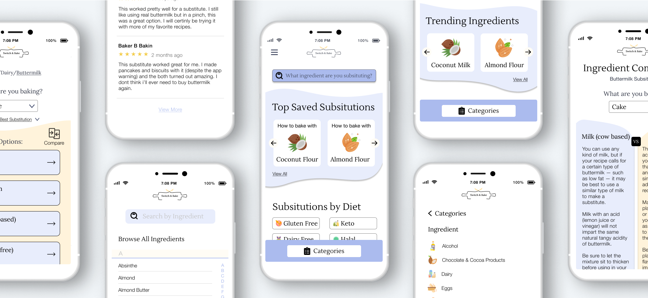
Switch & Bake is a new mobile application that caters to bakers of all skill levels. Through this app, you will learn about the science behind baking to gain knowledge and improve your skills in the kitchen. This platform provides substitution solutions for the most common or obscure ingredients. Users will have the option to browse through categories or search specifically for the ingredient they want to change in their recipe. The substitution options can also be compared against each other so the baker can find the best replacement for their needs and recipe.
How might we help users gain confidence and knowledge in the kitchen through baking?
Solution
An intuitive mobile app that allows bakers to find substitutions based on expert knowledge and user ratings.
Designed to help ease the frustration and uncertainty of making an ingredient switch, this new feature ensures that users find substitutions based on expert knowledge, science, and user reviews. This knowledgeable solution is designed around a community of bakers looking to make the most out of their on-hand ingredients and time in the kitchen.
Feature Overview
Users will locate the ingredient they are looking to substitute out of their recipe by directly searching for the ingredient or browsing through the list of categories.
Once the ingredient is found, users can choose to compare two ingredients against each other to find the best substitution for their recipe and needs.
Structuring Our Approach
Outlining Objectives
Discover trends and evaluate strengths and weaknesses of other apps catered toward substitutions in baking or cooking
Understand users’ motivations for substituting ingredients and how frequent users bake.
Explore users’ approaches and expectations of where ingredients belong based on the established categories list.
Research Methods
Market Research
Competitive Analysis
User Survey
Hybrid Card Sorting
What does the data say?
Market Research
Conducting market research helped to identify the app's target users and general trends of social apps.
1.
Sales of baking mixes and ingredients rose 25% in 2020 to $8.3 billion, according to market researcher Mintel Group.
2.
According to a January survey of 2,000 adults by Mintel, when participants are asked why they are baking more often, 39% said relaxation.
3.
Americans are both cooking (54%) and baking (46%) more. Moreover, 50% report they’ve become eager to learn as much as possible about cooking, and 73% say they’re genuinely enjoying it more than they used to.
Scoping out the Competition
In performing this analysis, I found that many of the current apps on the market serve users with dietary restrictions or those measurement comparisons. However, no app offered reasoning or data to educate and inform users. This comparison highlighted a market opportunity for a mobile application that focused on substitutions specific to the art and science of baking.
Defining Potential Users
With our secondary research, three provisional personas were created to use as a guide for finding people to interview. The personas showcase three potential bakers with varying skill levels and motivations.
Interviewing Our Users
User Research
To best understand our users and reach the widest range of bakers, a survey was completed by 13 participants and in-person user interviews were conducted with 4 participants.
The users that participated in the study have a range of baking abilities. These interviews were conducted to gain insights into the user’s habits and history of baking, as well as motivations and confidence for performing substitutions.
At the close of the survey and after the final interviews were conducted, I gathered my findings together to determine 3 patterns of importance.
Key Takeaways
Upon transcribing the results, I was able to determine patterns of importance to the users.
Baking is relaxing and a therapeutic exercise.
3 out of the 4 users interviewed and 9 out of the 13 survey participants stated their primary motivation for baking is to relax and they find the exercise to be therapeutic.
Substitutions occur due to a lack of an ingredient or dietary restriction.
11 out of the 13 survey participants, and 2 out of 4 participating user interviewees substitute an ingredient due to lack of a particular ingredient. 4 out of 13 survey participants are substituting to adhere to an allergy or dietary restrictions.
Hesitancy or lack of confidence is common in performing substitutions.
All 4 users interviewed and 9 survey participants stated they were sometimes confident in their abilities to successfully change an ingredient, while 2 survey participants have no confidence in substituting in a recipe.
Introducing Our User
The data accumulated from secondary and primary research was then used to create the project's primary persona, Brian. Brian wants to adventure on new trails and meet new people in his area so that he can enjoy his free time and explore the outdoor landscape in his area.
How might we…
Point of View
The users’ needs were then framed into actionable problem statements and solutions were provided.
How might we ensure the mobile application puts users at ease while remaining friendly and reliable?
How might we allow users to see ingredient options for dietary needs or filter by restrictions?
How might we help users gain confidence and understand the science and reasoning behind picking a particular substitution?
Prioritizing Features
Each idea was explored, listed, and put into a table to be prioritized. From here, I evaluated the amount of implementation effort each feature would require and my confidence level in its placement. There were three priority levels established. Most features with high confidence levels were of the highest priority and served the business benefit of intuitive design.
Establishing the Flow
Once I decided on the app's features, I moved my focus efforts to outline the structure of the app and the flows that users will follow during testing. The flows allow me to see how the different screens and features of the app will interact with one another.
Task Flows
-
Participants are asked to find a cow’s milk substitute for buttermilk.
-
Participants are asked to compare the substitutions of milk and yogurt to use in place of buttermilk.
Setting the Frame
Utilizing the research findings and flows as a guide, I sketched out multiple iterations of screens for the tasks. This highlighted where elements would be located and how they would look.
Creating a Brand
Establishing Identity
With the structure of the app sorted out, I moved on to defining Switch & Bake’s core brand attributes. After thinking through the problem the app was trying to solve, I chose the words bright, soft, friendly, playful, and comfortable to represent Switch & Bake. Using these words, I created a mood board to guide the app's font, color, logo and image choice.
Originally starting with a logo that met the needs of playful and friendly, the small retro ovens were the first iterations of the design. These logos, however, were not the right approach. They became difficult to scale and did not meet a brand standard of bright and soft. A second design session was performed and the final logo was established. The recognizable rolling pin with curved edges and adjoining wheat stocks shows a brand that is familiar, friendly, and approachable.
Designing a System
Following the creation of the logo, I created a style guide and UI kit to make sure that the app's design remained consistent across elements and screens. This is a fluid document that other designers can add and refer to during future iterations.
Pulling it All Together
By utilizing my sketches and applying the established styles to the screens, I created high-fidelity wireframes for Switch & Bake. Usability testing was performed with high-fidelity wireframes because I wanted to test out our new design system with our users. Since everything was created from scratch, it was important for me to see how users would interact with the color palette, typography, images, cards, and buttons. My aim is for users to be able to use the features intuitively and flow through the tasks without any frustration.
Additional frames were created in the prototype explaining to participants the goal of the task ahead. This also instructed users on when to start the task and when the task was complete to pause for questions.
Insights from Testing
The usability test was conducted on 6 participants. The participants were given the working prototype, which included written tasks for each individual to follow. Utilizing the think-aloud method, I was able to ask clarifying questions to users.
Synthesizing Our Test Results
Participant observations were organized into categories to help identify areas of improvement. These patterns were then translated into design recommendations. From here, I created a prioritization matrix to guide my focus.
The Grand Finale
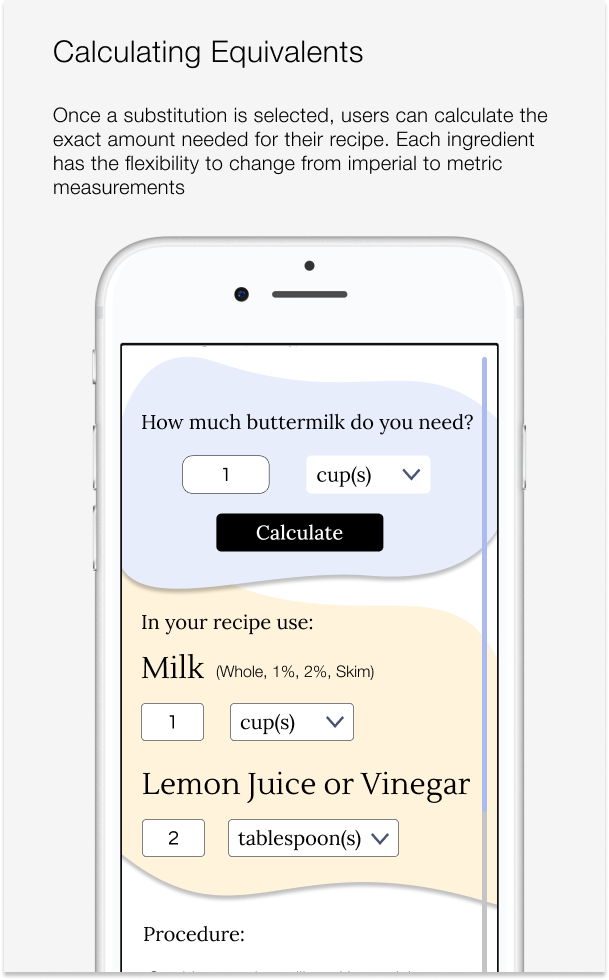
The solutions to user’s observations were implemented and the design was updated. The updated screens showcase a few of the changes, as well as some notable features of the project. Once this step was complete, the features were ready to move on to development.


Play with the Prototype
Wireframes were then created into the clickable prototype below with Figma. Please feel free to explore the app. As a reminder, users were asked to find the cow’s milk substitute for buttermilk and then compare milk and yogurt as substitutes for buttermilk in their pancake recipe.
Final Thoughts
Reflecting on Important Lessons
I came across two challenges that caused me to completely re-evaluate my approach to the logo design and the search function verbiage.
(1) Prioritize Simplicity
The first challenge came in the form of a complex logo design. The process of simplifying the logo required many hours of thoughtful consideration into what made Switch & Bake unique and how branding could highlight, and not distract from, the
(2) Testing Language is Important
The second challenge popped up during usability tests. Almost all of my participants were confused by the messaging in the written prompt for the test. If tests weren't moderated, I would not have seen each participant's frustration and confusion in their facial expression when searching for the ingredient in the prompt.
Their hesitation caused me to reevaluate both the approach of the written prompt and the original design for the landing page of the app. This lead me to rework the placement of the main navigational features in the latest iteration of the design.


